
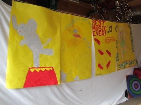
The next day of our circus/carnival themed art lessons was painting posters. I ordered a large roll of yellow paper. The kind you typically see used for bulletin boards at school. I asked the kids to paint a poster advertising for an act or performance at a circus or carnival. I showed them some vintage circus poster examples online (googled images of vintage circus posters) so they would have an idea. We don't see a lot of circus posters here in the suburbs. I also showed them a couple of Toulouse Latrec posters and the classic "Chat Noir" (again googled images). I emphasized making sure the most important words are largest and the rest are smaller. I also pointed out how in the Chat Noir and in many toulouse latrec posters only a couple of colors are used and the posters really stand out -sometimes keeping it simple is a good idea. I also demonstrated drawing a sketch of the poster first on scratch paper and writing out the words so you can find the center of the words, start in the middle and work your way to the sides so the words are centered.
After my intro I passed out the paint and let them go at it. The older kids seemed to catch on, but for the younger ones that is getting a bit complicated. If I had a class with all younger ones I skipped all the centering advice and just let them paint.
Improvising is okay- some kids made a mistake, like spilling or painting something different then how they wanted, but that's okay. I spill can be turned into something else. Or for example, my son wanted to paint two lions fighting, but painted one too big so he didn't have room for the other lion. I gave him the option of starting over if he really wanted, what he thought he would have to do, or painting the other lion on another piece and then taping the two posters together for one giant poster. He decided he liked it with one. One looks great. My point is be willing to be flexible and creative with what you have.
For this project we used tempera paint. I have not always been a fan of tempera. It always seems to dry way lighter and powdery. It's pro is it is thicker than water colors so it is easier for young children to use, is washable, and is cheaper than acrylic paints and that's why I decided to go with it for this project. I am now going to have take back my comment that Crayola has the best art products. I bought the Dick Blick brand tempera paints and am amazed! The Dick Blick tempera has great colors, great for mixing, nice and bright, and they didn't fade when dry. I highly, highly recommend them. I am very excited about this product. :) We will be using it again for our next set of lessons coming up.
Using big bright yellow pieces of paper was a lot of fun. I love the pictures of the kids busy working so hard to create their fun ideas of a circus down on paper.


No comments:
Post a Comment